The heat press project was a project that we were going to do on the vinyl cutter and then press the design on a shirt. I was stuck debating what to do for about an hour. I wasn't sure if I wanted to do something D&D based or pride based or something else entirely. I was excited to see what I would come up with it because I only ever really wear printed shirts.
|
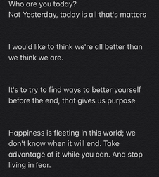
I had a pretty basic understanding of what I wanted to do for my heat press project. I wanted to do something that was simple yet powerful. I wanted to do a quote from my favorite podcast but didn't want it to take up too much space so I used a fragment of a quote. I made a list of quotes I could possibly include and worked forward from there. Some of them seemed too sad and some of them weren't exactly what I was looking for.
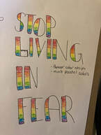
Eventually my Dad helped me pick a quote and I started to look for fonts I could use. I really like writing in fancy fonts because it makes me feel creative. I ended up with a simple one but I really liked it. Then I got to thinking about colors that I could put in the spaces and I decided to do the rainbow. I didn't initially want to do a pride piece but with everything else in my life, it ended up that way. I added a couple notes as to what I wanted to do on the digital version and fixed where I messed up.
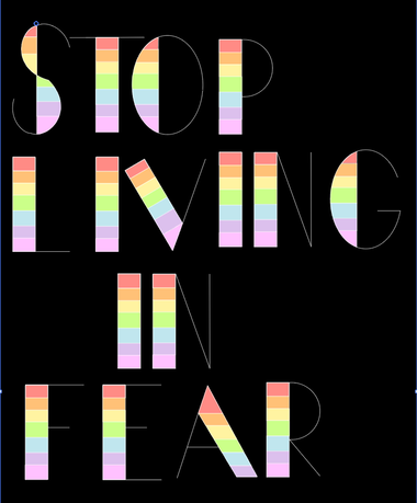
I remembered that most of the clothes I wear are black so I operated under the assumption that should I print this, it would be on a black shirt so I started to try to think about how it would look on a black shirt. I decided the lines should be white and the colors should be lighter. I ended up picking a pastel color palette because they seem really positive. It took me forever to figure out how to get the color blocks inside the weird shapes. (The rectangles were fine, it was just the triangles and the rounded shapes.)
If I had to change one thing with this project I would probably make the lines in the letters thicker, I feel like you can barely see them and they don't stand out well enough. I would also redo the "S" it has a weird bump on the bottom half and I don't like it.
|
I got a lot more comfortable with Adobe Illustrator and spent a lot more times considering color palettes and design choices. I had a really hard time picking a design with at least four colors but I'm proud of the one I came up with. I realized that I should look back at at the outlines before I start coloring so that I can make sure that I did things right. (The S and the amount of spaces in the letters, there should only be six.)
